
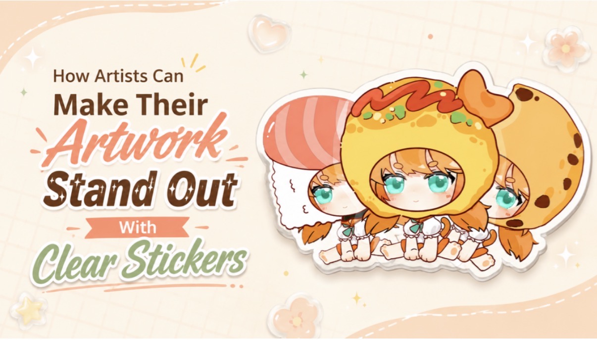
Anime-style character artwork displayed as a clear sticker for an artist merchandise guide.
Ever finish an illustration you love, turn it into a sticker, and wonder why it suddenly looks a little… flat?
Clear stickers can do the opposite. Because parts of the sticker disappear into the surface beneath them, the artwork can feel more integrated with whatever it is placed on. Sparkles can float around a logo without a visible background block.
The trick is that clear stickers are not just ordinary stickers with the background removed. The transparent material becomes part of the design.
Why Clear Stickers Change the Way Artwork Reads
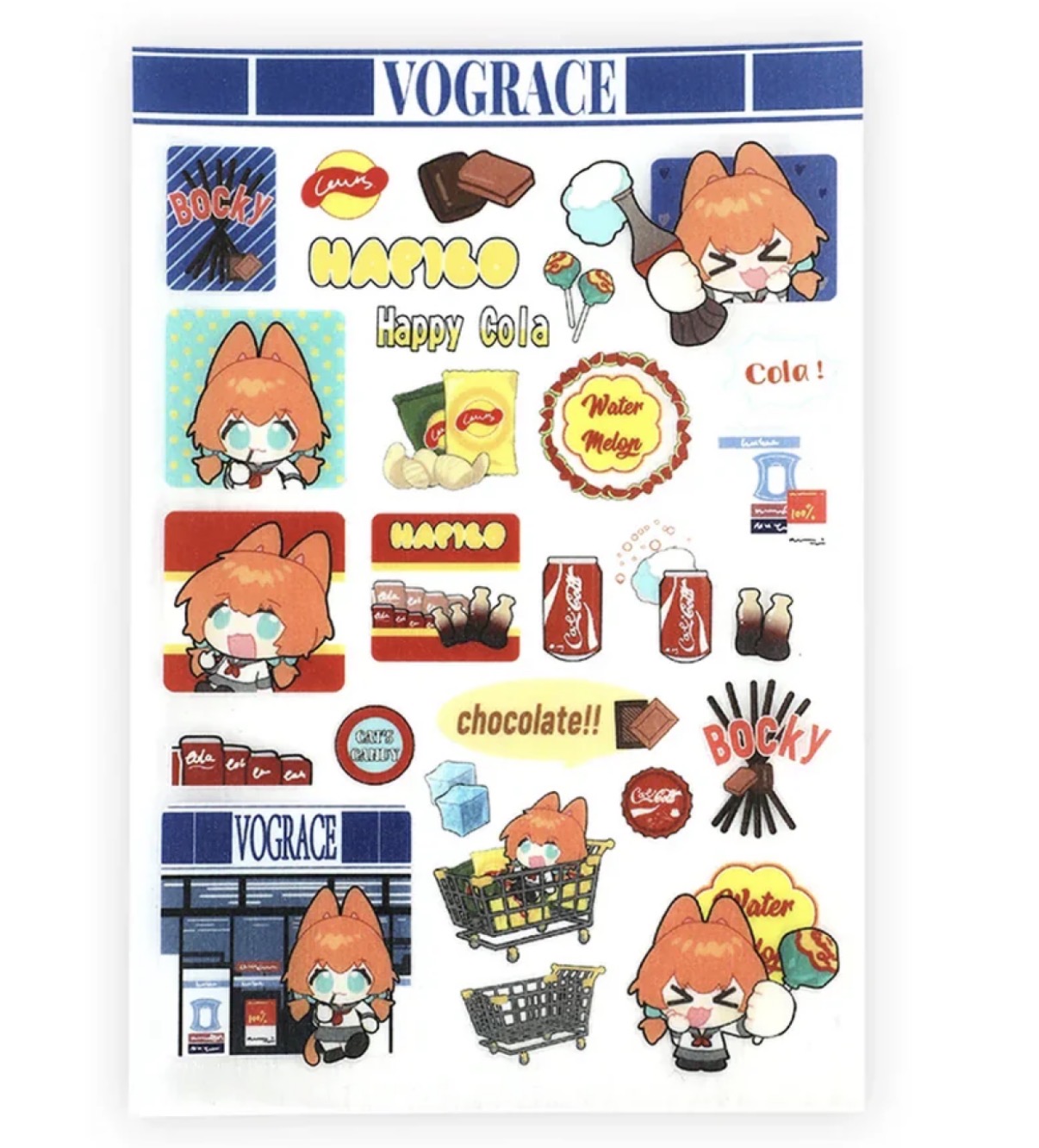
Vograce clear sticker sheet featuring anime-style characters, snacks, and colorful illustrated designs.
With a regular white sticker, your artwork sits on its own little canvas. With a clear sticker, the object underneath becomes part of that canvas too.
That creates a new design question: “What happens when my background is no longer white?”
If you are exploring custom transparent stickers, think about where people may place them. Laptop lids, phone cases, notebooks, display cases, and water bottles can all have different colors and finishes.
A design that looks perfect on a white artboard may lose contrast on a dark surface. Pale details can disappear, while fine lines may become harder to read. Designing for transparency means planning for those possibilities before printing.
Design Choices That Make Clear Stickers Pop
Clear stickers work best when the artwork is easy to recognize at a glance. A strong silhouette helps, whether that means a chibi character with an expressive pose, a creature with distinctive ears or horns, or a bold logo that still reads from a distance. If the design depends on lots of tiny disconnected details, the transparent areas around them can make the composition feel scattered.
Outlines can also help separate the artwork from whatever surface sits underneath it. Dark outlines are especially useful around pale colors, although they do not need to surround every tiny detail. Ask yourself, “If someone puts this on a dark blue laptop instead of a white notebook, will the character still be easy to understand?”
Transparency itself can become part of the artwork too. Instead of treating clear space as “nothing,” use it around stars, flower petals, flames, magical particles, wings, or motion lines. Those gaps allow the surface underneath to show through and can give the finished sticker a more layered, intentional look.
Check Light Colors Before Printing
White and very pale colors deserve extra attention on transparent material. Their final appearance can depend on the printer, ink setup, material, and whether white ink is printed beneath parts of the design.
Do not assume the white areas on your screen will automatically look the same on the finished sticker. Check the printer’s artwork requirements and proofing options first. If needed, ask how white ink and transparent areas will be handled.
- Pro tip: Make two quick mockups before exporting. Place your artwork over a black rectangle and then a white one. It will not perfectly reproduce the finished sticker, but it can reveal pale details that need more contrast.
Match the Sticker Style to the Artwork
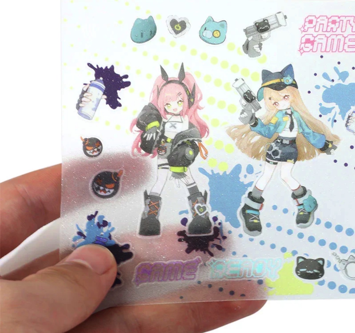
Vograce transparent sticker sheet featuring colorful anime-style character artwork and graphic designs.
A bold mascot may work best with a compact cut shape and only a few clear gaps.
A magical-girl illustration could use transparency around sparkles or transformation effects. A fantasy creature might look better with clear space between the tail, wings, and surrounding effects.
Before finalizing, shrink the design to its intended physical size on screen. Details that look beautiful while heavily zoomed in may become nearly invisible once the sticker is only a few inches wide.
Prepare the File With Production in Mind
A good illustration still needs a print-ready file. Follow the printer’s own template and artwork instructions, since file formats, cut-line setup, bleed, color settings, and resolution requirements can vary.
Before uploading, check:
- Is the artwork sized for the final sticker rather than enlarged from a tiny file?
- Are important details safely inside the cut area?
- Are transparent areas actually transparent in the file?
- Are thin lines and small text still readable at final size?
- Have you checked the design against light and dark backgrounds?
If a digital proof is available, take a moment to review it carefully before approving production. Check the cut shape, orientation, transparent areas, positioning of important details, and any white-ink layers shown to make sure everything matches the way you intended the final sticker to look.
Let the Clear Material Do Some of the Work
The best clear sticker designs do not fight the transparency of the material. They use it.
Instead of filling every empty space, decide what should disappear. Instead of designing only for a white screen, imagine the artwork living on real objects. Keep the focal point easy to understand and let the surface beneath the sticker become part of the final composition.
When the artwork and material work together, the result feels less like a picture placed on top of an object and more like the illustration belongs there.